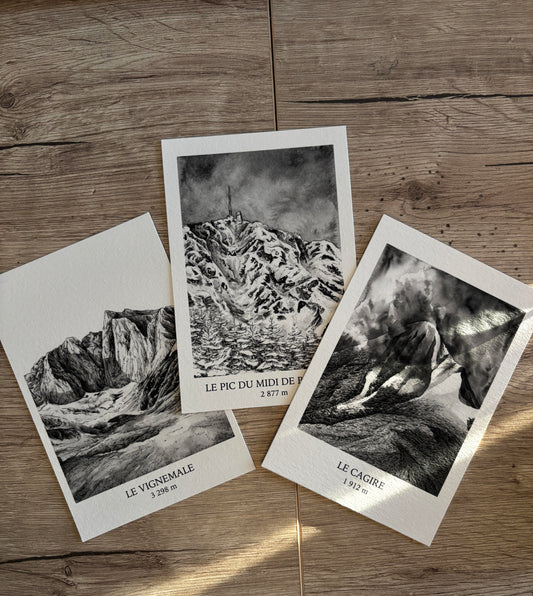
One might think that the choice of medium is secondary.
That a drawing remains a drawing, no matter the tool.
But in reality, everything starts there.
Even before the subject.
Even before the composition.
There is a material.
And in my work, this material is always the same: India ink.
Not out of habit.
Not out of ease.
Because it is the most fitting.
A medium that leaves no room for hesitation
India ink has a simple peculiarity:
It is unforgiving.
Unlike pencil, you can't erase.
Unlike paint, you can't easily cover it up.
Every stroke is definitive.
And that's precisely what makes it interesting.
Because it demands:
- To slow down
- To observe
- To understand before acting
It's impossible to draw "randomly"
A discipline of observation
Working with India ink requires developing particular attention.
You cannot accumulate strokes.
You have to choose.
What is essential?
What can disappear?
This selection is at the heart of the work.
And that's exactly what the mountain demands.
The mountain: a demanding subject
The mountain is not a simple subject.
It is complex.
Not in its details, but in its structure.
One misplaced line, and everything collapses.
One misunderstood shadow, and the depth disappears.
Drawing the mountain is seeking a balance.
Between:
- Mass and void
- Light and darkness
- Precision and suggestion
Black and white: a necessity, not a style
You could add color.
Nuances.
Effects.
But very quickly, an obvious truth emerges:
Color adds nothing here.
Or rather: it distracts.
The mountain exists through:
- Its lines
- Its contrasts
- Its breaks
Black and white reveals this.
Without distraction.
Without unnecessary interpretation.
Ink as living material
India ink is not uniform.
It lives.
Depending on the pressure,
Depending on the gesture,
Depending on the amount applied,
It can be:
- Dense
- Light
- Diffuse
- Sharp
And it is in these variations that the drawing takes shape.
The gesture: between control and letting go
Drawing with ink is finding a particular balance.
Too much control, and the drawing becomes rigid.
Not enough, and it becomes blurred.
You have to be precise... but accept a degree of unpredictability.
And that's exactly what links this medium to the mountain.
A strong structure, but never static.
A necessary simplification
Ink forces simplification.
Not simplification in the sense of reduction.
But getting to the essence.
What makes the mountain stand?
- A ridge
- A line
- A mass
Everything else can disappear.
Why this medium changes perception
An India ink drawing is not looked at like a classic image.
It demands another type of attention.
The eye does not seek realistic detail.
It seeks:
- Coherence
- Structure
- Balance
It becomes more active.
And in an interior?
This simplicity also changes how the artwork integrates.
Black and white:
- Adapts to all spaces
- Does not overpower
- Creates a calm presence
An India ink artwork does not invade a space.
It balances it.
A demand that can be felt
Even without knowing the technique, something is perceived.
A form of precision.
Of rigor.
Of restraint.
And it is this demand that gives the drawing its strength.
Extending this approach
If this way of representing the mountain speaks to you,
If this simplicity and depth appeal to you...
Then some works are designed for that.
- To restore the strength of the line
- To respect the balance of the drawing
- To bring this presence into your space
Black and white art prints
Limited editions with certificate of authenticity
Inspired by the peaks